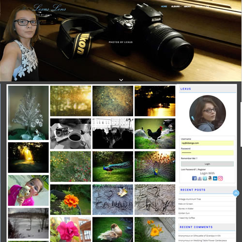
Lexus Lens Photography was created for my grand-daughter who has a keen eye.
Lexus needed a means to add and manage her own photographs so a content management system was needed. WordPress is a common content management system with many stock themes and various widgets available. The site was heavily customized through additional css based on AcmeThemes-Infinite Photography Pro © 2018. to give a look and feel that Lexus was happy with.
Lexus desired the option for people to comment on her photos. The blog feature included with WordPress met her needs. There is also a means for visitors to log in using their social media account thus not having to remember yet another username and password.
Visit the site at: https://lexuslens.ca/
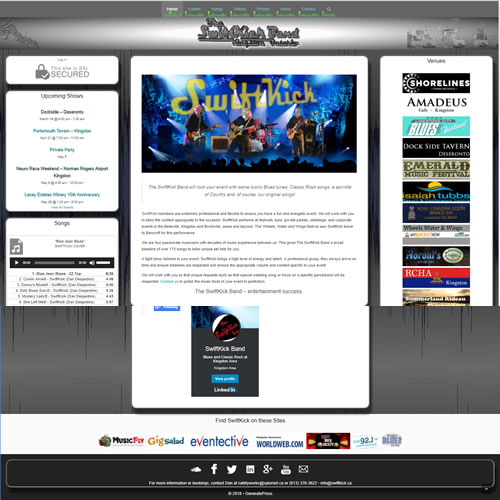
The SwiftKick Band site is a WordPress site selected to accommodate the needs of the band. They need the ability to add upcoming events and music.
Visit the site at: https://www.swiftkick.ca/
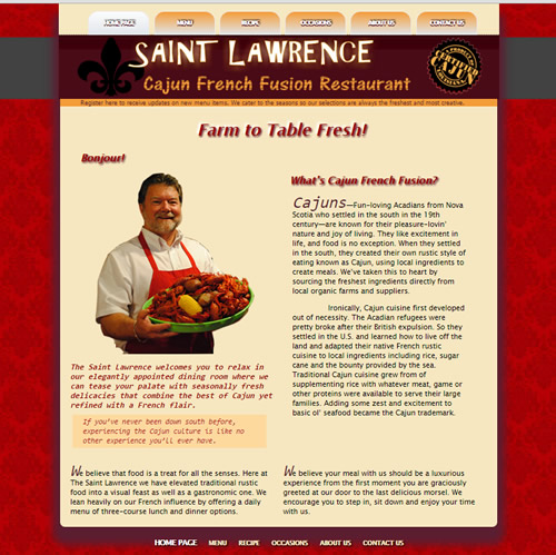
Saint Lawrence Cajun Restaurant is a fictitious site created for the Web Design 1 course.
During the planning process, a formal mood board provided a plan for the overall look and feel of the site. The logo is an original creation which glows on the page. The color palette was extracted from various Cajun advertising with a correlation to spices used in Cajun cooking.
Special care was taken to select typography. A larger font was used as well as the lines were spaced out a bit more for readability. Little touches such as enlarging the first letter of a paragraph and use of blockquotes all assist in pleasing the eye and drawing attention to the correct places.
Usability was another key consideration. The main navigation is fixed at the top of the screen and echoed in the footer. This way, the customers can easily navigate to any page they like. Also note along the bottom of the header on every page is the means for customers to register with their e-mail.
Visit the site at: https://www.idzenga.com/demo/stlawrence/index.html
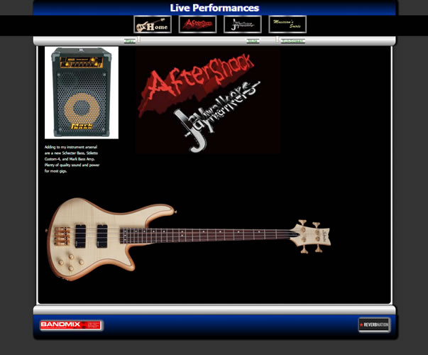
Live Performances arose from a requirement on a Javascript course. The requirement was to build a valid web page using the jQuery AJAX load function.
This project was chosen as a basis for another section of the Idzenga personal home page. What better way to showcase video performances. A play list was created from three music projects, the Musicians' Soiree, The band Aftershock, and footage from when the Jaywalkers.
Visit the site at: https://www.idzenga.com/demo/music/loader_music.html
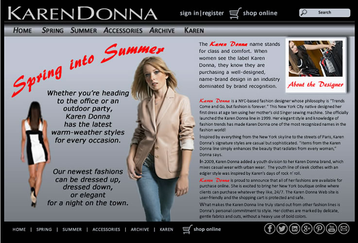
Fashion Design is just an image of a front page concept arising as part of the course Web Graphics using Fireworks. This design employs a monochromic palette and uses a single hit colour of red.
Visit the site at: https://www.idzenga.com/demo/karendonna/karendonna.html

Financial Freedom Family was a requrement of the Web Graphics using Fireworks course. This ficticious company had requested two different designs for their main page. This image represents the first design proposal.
Visit the site at: https://www.idzenga.com/demo/finance1/financial1.html

Financial Freedom Family was a requrement of the Web Graphics using Fireworks course. This ficticious company had requested two different designs for their main page. This image represents the second design proposal.
Visit the site at: https://www.idzenga.com/demo/finance1/financial2.html
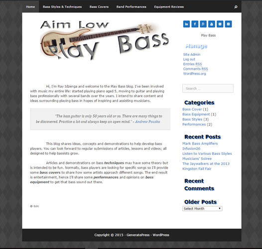
Play Bass is a blog created to satisfy the requirements for an exercise on the Web Design 1 course but is now a part of the Idzenga personal website based on the WordPress engine.
The project asked to define the client, content, and target audience for a blog site, and plan the typography and visual elements effectively for your client. An existing WordPress template was fully customized using CSS to style properties such as font-family and font-size, and establish page hierarchy. Text columns and paragraphs were styled for optimum readability and attractiveness, through use of indents, block paragraphs, initial caps, or blockquotes. Appropriate and effective use of color and graphic imagery were employed to complement the typography-based design.
Visit the site at: https://www.idzenga.com/playbass/
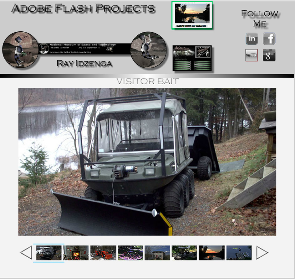
Adobe Flash may be on the decline in its use, but a need still exists. The course saw the development of 5 different products:
- Game Character
- Advertising Leaderboard
- Animated Character
- Photo Gallery
- Video Jukebox
Visit the site at: https://www.idzenga.com/demo/flash/portfolio.html
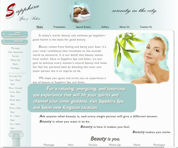
Sapphira Spa is the result of an exercise on the Web Design 1 course. The objective was to produce a functioning website based on input from a fictitious customer.
The design process involved several steps including a wireframe and mood board. The palette was selected to reflect luxury and elegance mimicking the spa and salon where one could pamper oneself.
Visit the site at: https://www.idzenga.com/demo/sapphiraspa/index.html
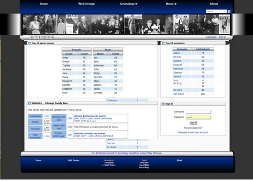
Genealogy, the Idzenga family tree, was the impetus which started the whole website. The site had evolved from separate html pages for each individual to a database. The genealogy information is stored in an SQL database and the data presented through php scripting. The database and the majority of the scripting is based on Webtrees, an open source genealogy program. It now has the means to share the family information and collaboratively add to the gedcom file
Specific work on the site included creating a theme compatible with the remainder of the Idzenga website. There were some other minor programmatic changes needed to maintain the homogeneous look and feel.
Visit the site at: https://www.idzenga.com/webtrees/index.php
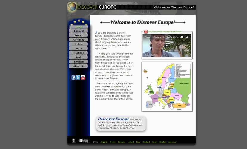
Travel Agency site - Discover Europe as part of the Dreamweaver 2 course.
The feel of the site is based on the banner, where the old black and white photo is augmented with a modern feeling logo. This theme is echoed throughout the site by using both black and white textured photos with modern colour high quality photos.
Visit the site at: https://www.idzenga.com/demo/europe/index.html
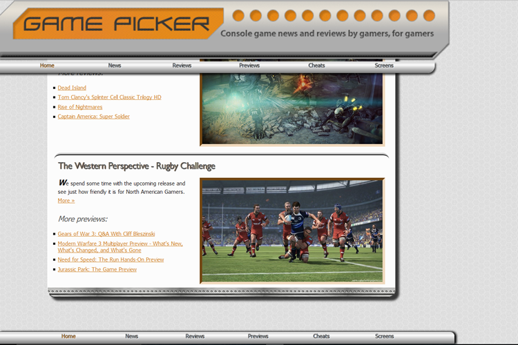
Gamepicker Gaming Site - Gamepicker, an exercise on the Dreamweaver 2 course.
The responsive design and the metalic/techno feel appeals to the gaming community. The provided logo was the basis of the metalic feel with an orange splash colour. The logo was also used as a "control panel" and fixed to the top of the screen.
Visit the site at: https://www.idzenga.com/demo/gamepicker/index.html
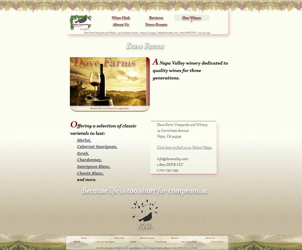
Dove Farms Winery - Dove Farms, an exercise on the Dreamweaver 2 course.
An old world feel is conveyed through the colour palette and background imagery. On the home page, a slide show advertises the main features of the winery including how to contact them. Let’s not forget the main purpose of the site - to promote their wines, hence a special drop down from the main menu takes you quickly and easily to specific wine pages.
Visit the site at: https://www.idzenga.com/demo/dovefarms/index.html